BRAND STRATEGY INTRO | LAURA ASHLEY
Objective: Communicating Brand Essence Through Surface Design
Context: This project introduces undergraduate students to the idea of brand essence: what gives a brand a strong identity and how brand DNA is made tangible through various layers of design attributes from visual messaging, form language, color and print, etc. to design strategy like product positioning, product line extensions, collaborations, and overall segment or category leadership. The work simultaneously specific and big picture. Students choose brands that are struggling- ones that have peaked and now have diminished competitiveness.
This is how the project unfolds…
STEP 1: Brand Deep Dive
We dive into brand history, its customers, and its key competitors, in order to build a strong sense of where the brand has been, it’s challenges and opportunities today, and where it should go. We focus on building a strong understanding of the brand’s essence- where it makes an emotional connection, and how that essence can be made tangible through design. We then create visual deliverables that shows the depth of insights and areas of opportunity.
Case for Design: Laura Ashley
Laura Ashley is a UK legacy brand with significant equity, new leadership, and a series of remarkable collaborations. The brand appears reenergized after restructuring from financial challenges and store closures, and the recent purchase of the brand, including all archives and IP, from the Boston-based retail investment firm Gordon Brothers Group.

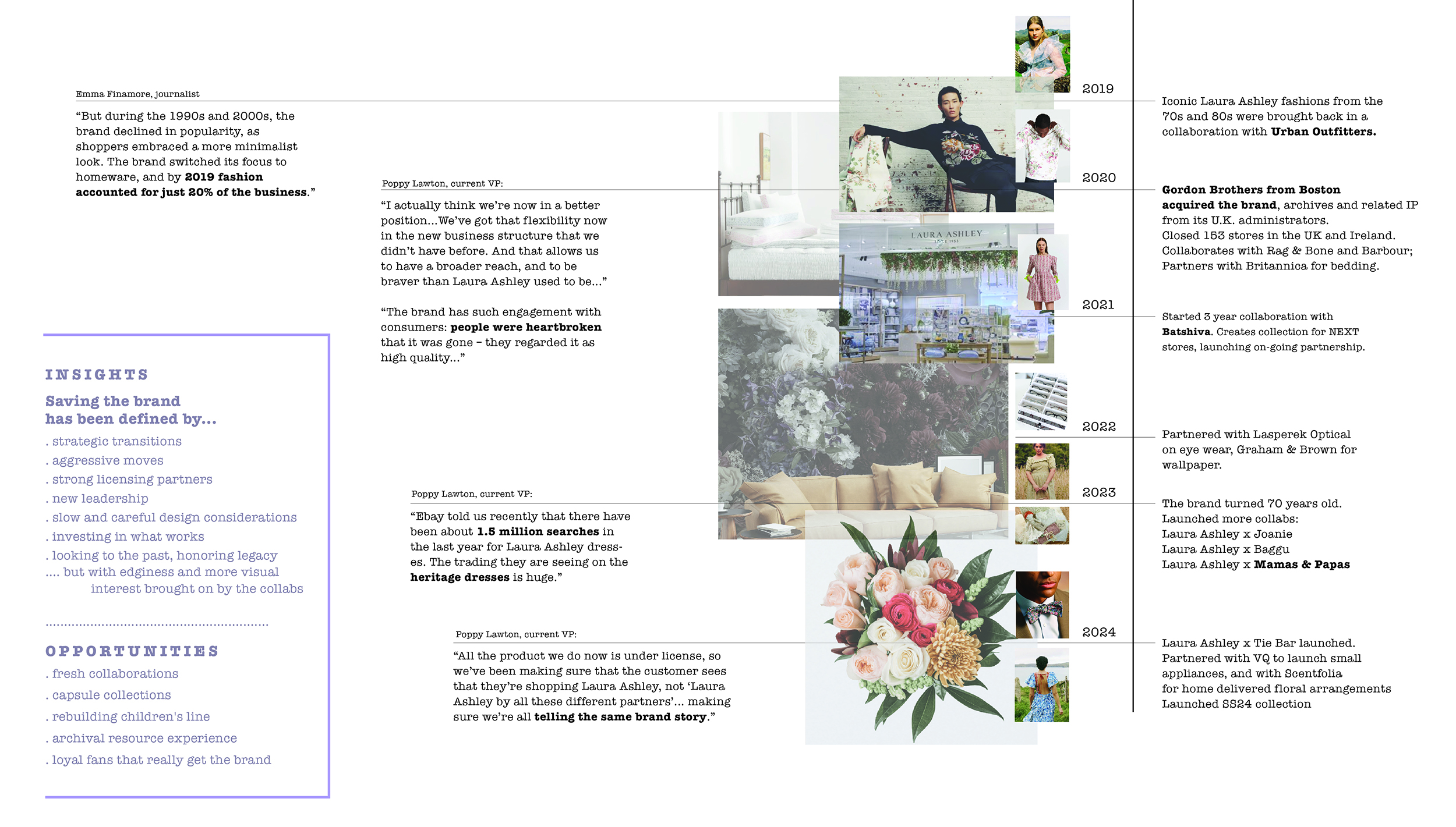
Laura Ashley’s rich history spans from the 1950’s to today, building and layering with each decade. The brand has remained aspirational, aways storytelling through thoughtful photography and collections that balance tradition and contemporary themes relevant in each era.
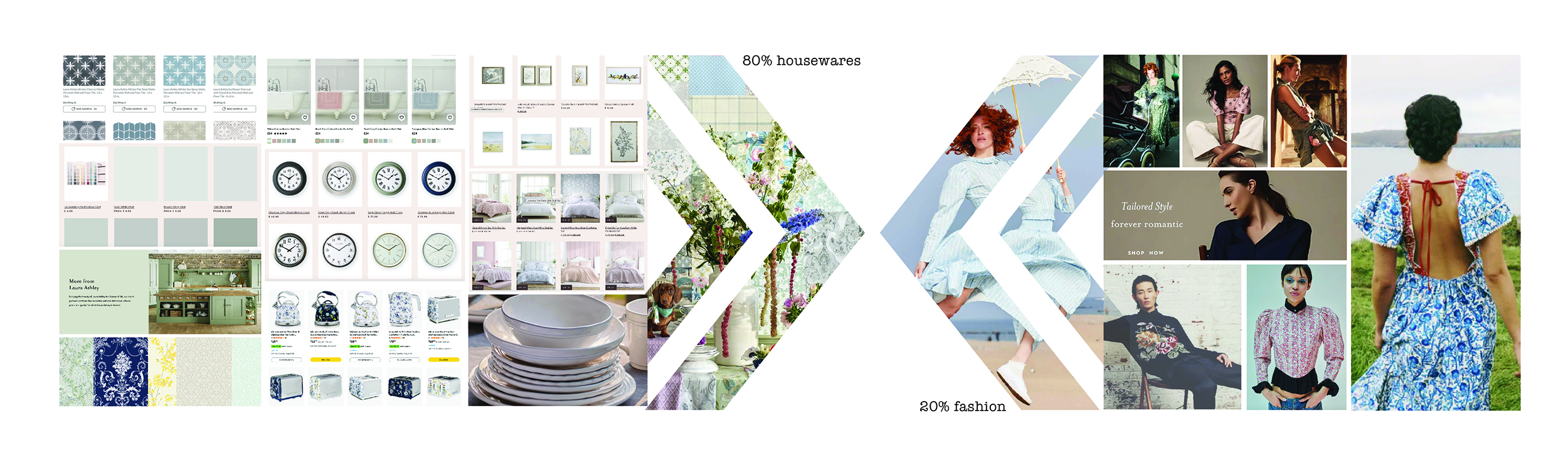
The Laura Ashley brand is known in the industry for numerous successful licensing partnerships which they continue to grow. However, this strategy brings with it the growing challenge of building consistent alignment across their entire product line, which, right now, feel disconnected with one look for housewares and another for apparel. This moment for Laura Ashley represents an incredible opportunity for the brand to reconnect with American consumers.
STEP 2: Benchmark Brand Analysis
While we are building a strategy, we investigate a minimum of 3-4 direct competitors. We evaluate many aspects of these brand against one another: features, style, materials, price, performance, and quality relative to competing brands, market trends, market segments, and industry standards. We then create a board that gives a visual overview of these brands, using captures from their website and summarized points of analysis.

In envisioning a Laura Ashley rebirth in the US, I looked at established and establishing brands and their strategies. Beyond aesthetics and style, heritage, and regionality, each of these brands has one key element in common with each other and Laura Ashley: fierce female entrepreneurs. Under the elegance and hyper-feminine is challenge, discovery, and metamorphosis.
STEP 3: Mood Board Envisioning
While we are building a strategy, we investigate a minimum of 3-4 direct competitors. We evaluate many aspects of these brand against one another: features,

I looked intently at American Southern and gothic gardening trends, which have a darker, more mysterious- maybe even damp- quality than the English gardens that have traditionally inspired Laura Ashley prints. The main focal element became these stunning moths that challenge more obvious, traditional butterfly motifs, and the plants that these moths attract. That ecological relationships that determine the prints create conversation pieces.
STEP 4: Surface Design Ideation
The project concludes with a surface design exploration, where we create unique repeat designs using traditional materials, procreate, and/or Adobe Illustrator. The concepts were walnut moth and their attractor bottom bush; hawk eye moth and their attractor the datura flower; and garden carpet moth and their attractor ornamental cabbage.
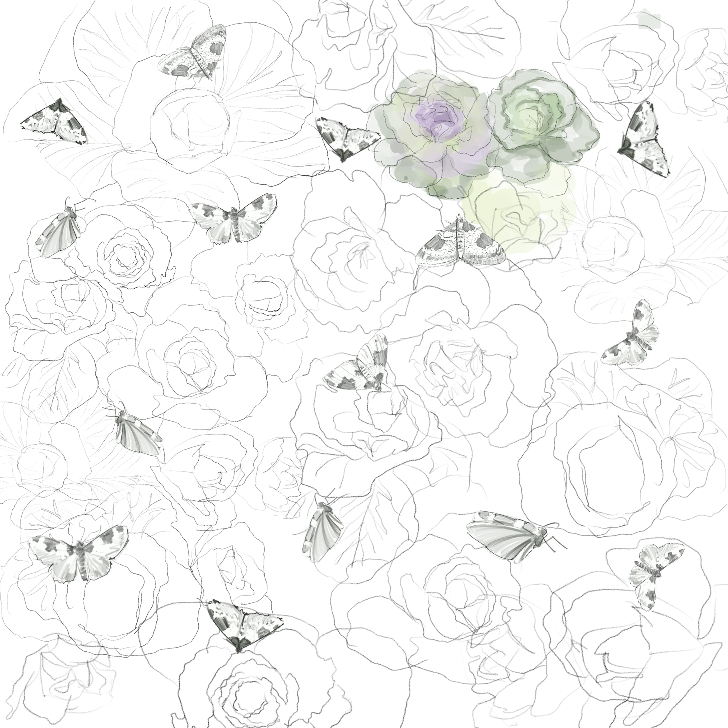

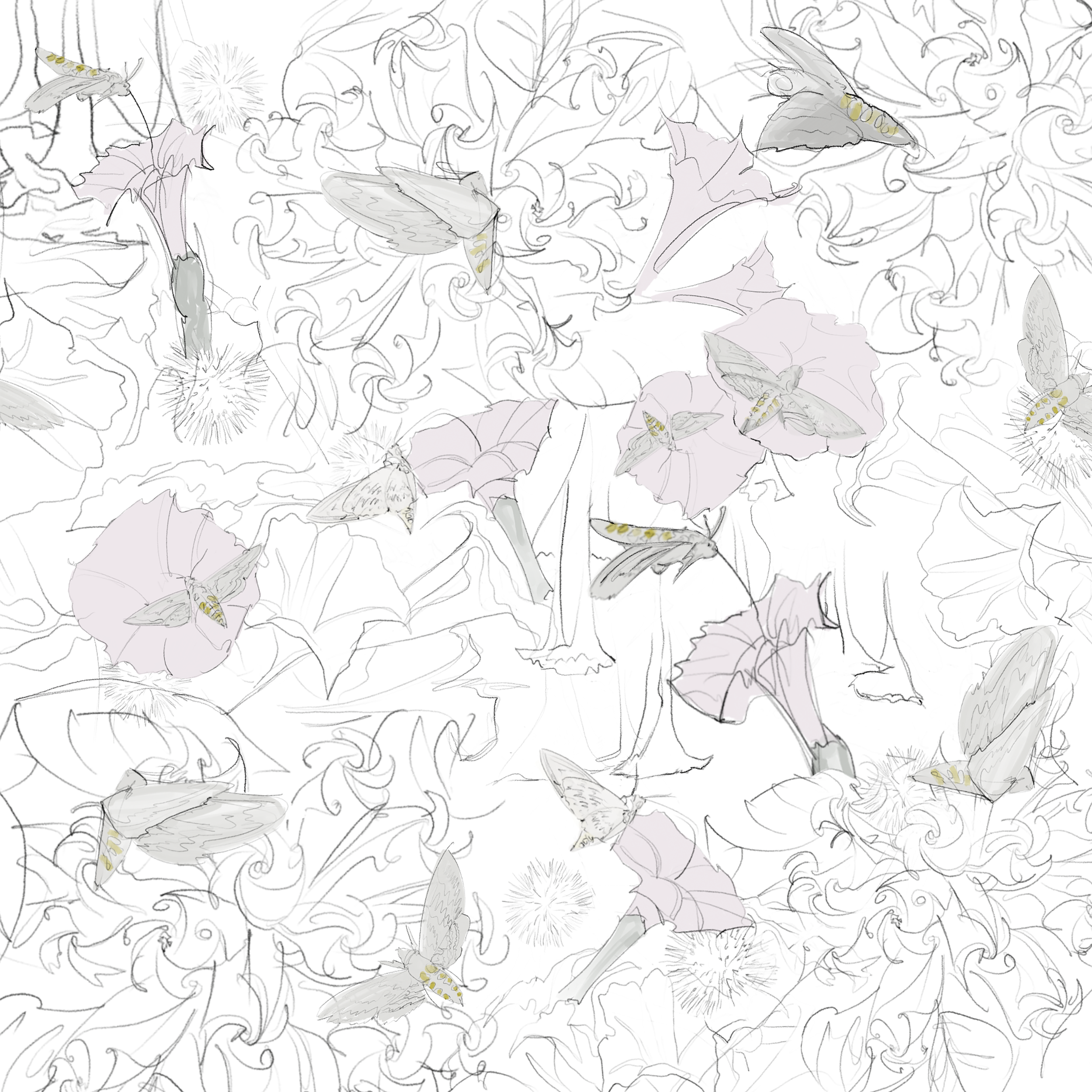
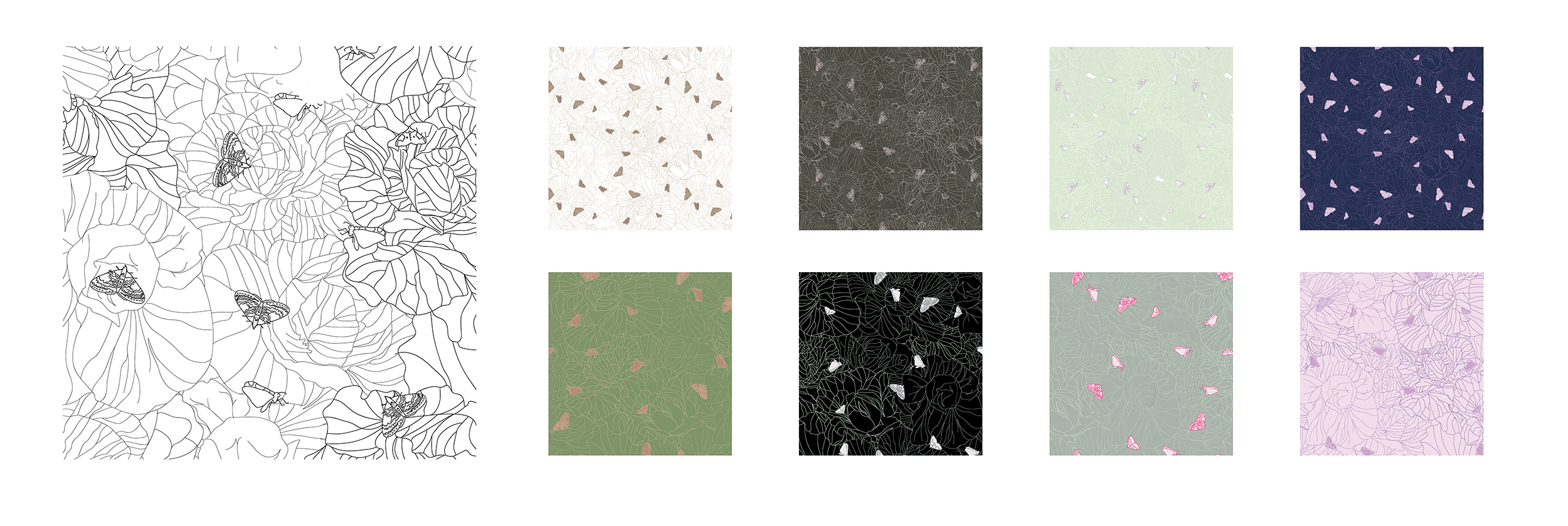

Final concepts: Like ABC and 123 prints for toddlers, these ecological relationship prints become learning tools and conversation pieces. They are Laura Ashley brand-appropriate sustainability statements in-and-of themselves.
