UX INTRO | HOLIDAY SHOPPING EXPERIENCE
Objective: A Digital Design Passion Project
Context: This project was created as a demonstration for undergraduate students in a Design Process course. The course is taken by BFA-Design majors concentrating in fashion design, interior design, industrial design, and graphic design, and business or engineering students minoring in design. The projects are flexible enough for all students to build applicable skills across the design disciplines.
Background: In this project, students begin to explore where digital design meets service design and the idea of the “user experience.” They are allowed to pick a topic that they are passionate about like a hobby or cause… something that they want to learn more about or become better at.
The areas of interest the students tend to choose are: making sustainable choices, living minimally, decorating a room, caring for a pet, crafting, cooking, assembling an outfit or wardrobe, trying out new looks, managing a budget, personal organization, preparing a meal, family household management, event planning, prepping for an interview, mental health and wellness, taking care of pets. Sometimes they take on something task related like signing up for classes, paying for parking, or ordering food.
Each student explores their topic from the standpoint of digital product design, focusing on mocking-up solutions like an app, or digital tool, or feature on a website. This work involves investigating the role of digital resources and tools that exist today relative to their topic, and where those resources are falling short.
STEP 1: Contextual Inquiry and Rapid User Profile
Students learn that contextual inquiry is a form of interviewing that is conducted by visiting users in their natural environment and observing how they use a product, perform a task, utilize a service, or otherwise have an experience of something. They begin by starting a conversation with at least 3 people who would be ideal user for their digital concept. They design and ask targeted questions about user experience and how the experience could be improved with a new digital product entry.

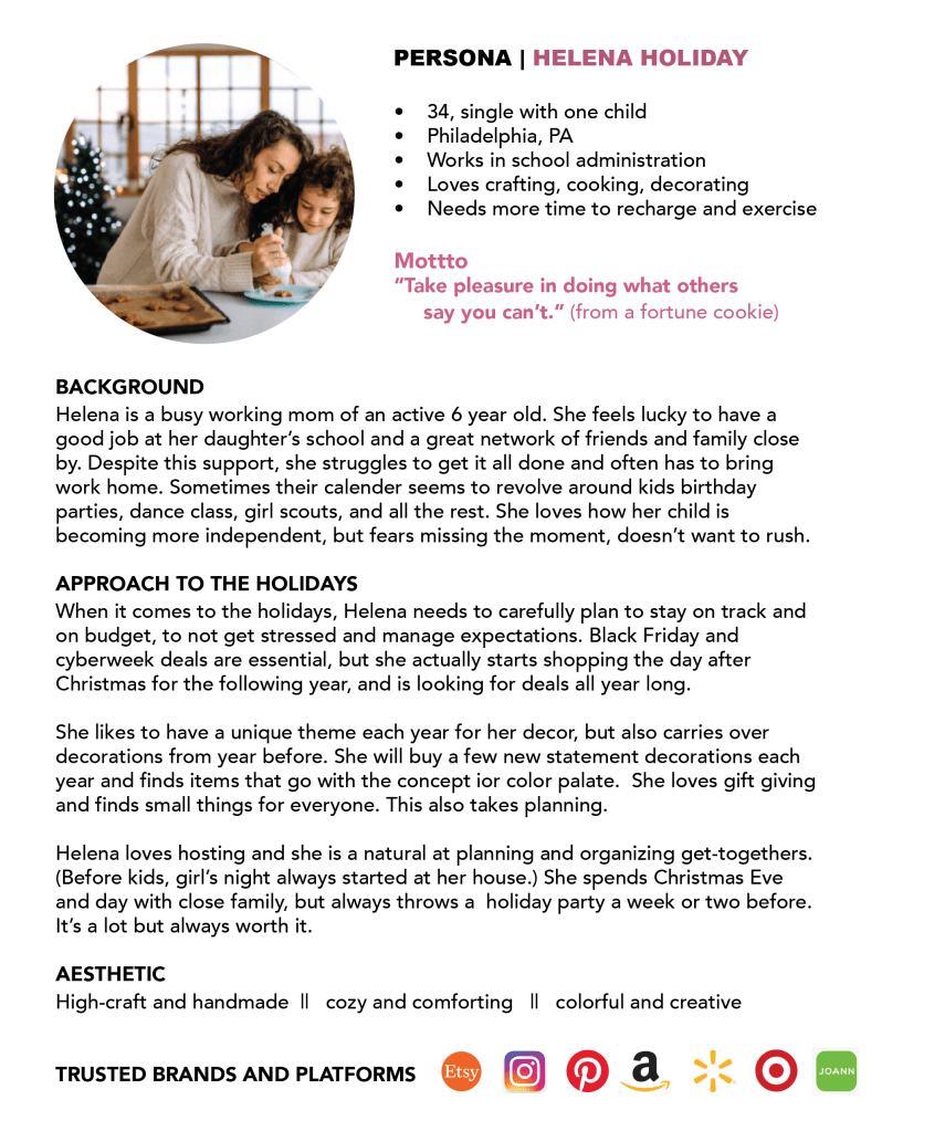
After contextual inquiry, students work along to create at least one rapid user profile / persona, which can be real or a factious amalgamation of multiple users. This includes 2-4 paragraphs with thoughts, observations, emotions, and actions, of the user as it relates to the topic. This includes basic demographic info, a photo and a 1-2 paragraph description, enough to create a rich mental picture for the hypothetical team and the audience.
STEP 2: Product scope and strategy
Referencing a tool from the lovely book “UX Methods; A Quick Guide to User Experience Research Methods,” by James Pannafino and Patrick McNeil, students set a scope for the app. They start to define the way that the various features and functions fit together, and how the scope determines the strategy for the product: what the people who run the app want to achieve and what the users of the app want to achieve. Students create 3 columns of needs and wants; features, functions, and tools; and benefits. The students are given prompts to help complete the columns and need to have at least 5 items in each column.

STEP 3: Journey Map
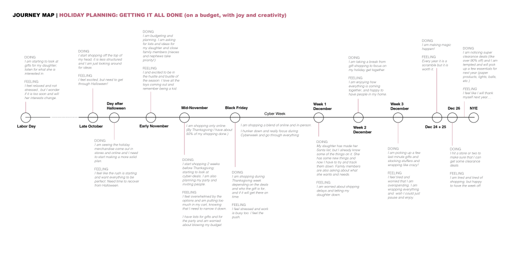
Students reference their insights to show the steps that users go through to achieve an outcome or goal, the obstacles or challenges along the way, and their emotional reaction at each step. They create a map illustrating the problem that they are trying to solve. You include photos, diagrams, drawings, and notes. They show the high points and the low points in the user experience, and identify the opportunities for design improvements / solutions that can streamline and improve the experience (i.e. solve for the pain points).
STEP 4: Simple sitemap and wireframe
The students begin to experiment with navigational flow, information design, and layout of each screen. They learn the difference between a wireframe as a bare-bones “skeleton” depiction of all of the components of a page / screen and how they fit together vs. high-fidelity surface design. The sitemap and wireframe can be created digitally or manually with sketches or post-it notes. Under each screen of the wireframe, they include a caption with few words to describe the function that the screen serves will serve and the attributes it will contain.

STEP 5: Select high-fidelity mock-up screens
Students are only required to mock-up 5-7 high-fidelity screens considering compositional refinement, color, graphics, imagery, fonts, etc. but most students go further. Emphasis is placed on how the tone of the band is conveyed through copywriting / text-based content. They are prompted to: Consider the brand personality of the product or company and the brand experience that they want to convey through the app design. Is it fun and lively? Silly and cute? Serious and trustworthy? Whatever it is, they need to make sure it is relevant and makes sense relative to your product. For example, if they are creating a financial planning app for people approaching retirement, they may not want the experience to be silly and cute. They may want it to be friendly, trustworthy, and direct. They learn to understand this nuance.
